Marketing is one of the most critical components in food packaging. You may have the best product on the market, but no one will notice it without impressive food packaging. Having the ability to market something efficiently can result in sales increasing through the roof.
Food choices in our society come in a variety of packaging options. Some have stood the test of time, simply due to the overall longevity of the brand. If you are trying to stand out from a crowded market, use creative food packaging ideas to strengthen your product’s marketability. If done correctly, you’ll both build a brand and have customers coming back.
Take a look at the food packaging for certain products, for example. Some food packaging ideas are designed to automatically have our eyes drawn to them, which more or less results in a sale. If you are looking for some imaginative inspiration, here are the six most creative food packaging ideas:
Idea #1: Gradients

Although gradients may seem like they ran out of coolness as we approached the 2010s, this wasn’t necessarily the case. Many candy products use gradients in varying levels to attract younger demographics to their products. Using them in the right manner can draw eyes, due to their whimsical mix of highlights and colors.
Gradient-inspired food products also allow for other parts of the packaging to stand out. Fonts can be more legible, which delivers an overall imaginative and effective design. If you are still deciding on how to proceed with your food packaging ideas, try giving gradients a shot!
Idea #2: Minimalism
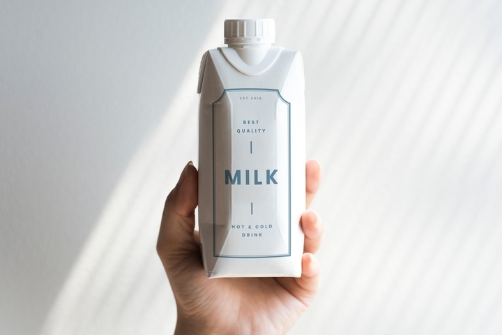
This can be considered the opposite of using gradients for food packaging, without the perceived negatives. As our society becomes more inclined with cool aesthetics, minimalism can be a great option for marketing your food products. What works for other products like technology or cars, almost always works for things you can consume.
For example, look at the simple black-and-white color palette used for some chocolate products. The intricate appearance radiates a sense of mystery, as well as luxuriousness. Overflowing your food product with colors may end up being counterintuitive, so keep your food packaging ideas simple!
Idea #3: Vintage
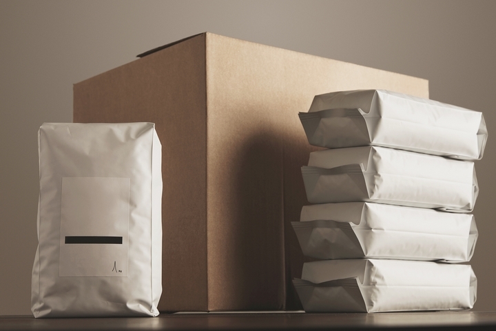
Most of us, if not all of us, enjoy a fresh cup of coffee. We enjoy caffeine so much, that we may sometimes opt to learn more about different blends and roasts. This leads us down the rabbit hole of picking different brands for consumption, some of which are designed in a very old-fashioned manner.
Artisanal coffee packaging, for example, uses timely fonts and detailed, traditional imagery to create a sense of belonging. This enables us to draw our eyes to the product, and inevitably trying it out of sheer curiosity. Sometimes, the old ways are the best, especially in marketing!
Idea #4: Environmentally-Friendly
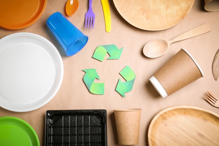
The more conscious, as a society, we become, the more we opt to use our spending power on products that are green. As a result, many businesses are trying their hand at reusable materials for food packaging ideas. This can come in many forms, due to the ability to reuse materials for future use.
For example, aluminum is being heralded as an innovative means to replace plastic for beverages. Some food packaging, such as coffee cups, can also be biodegradable as well, which only increases a good impact on the environment. We only have one planet Earth, so contributing to its sustainability in any way should be praised!
Idea #5: Bold Fonts
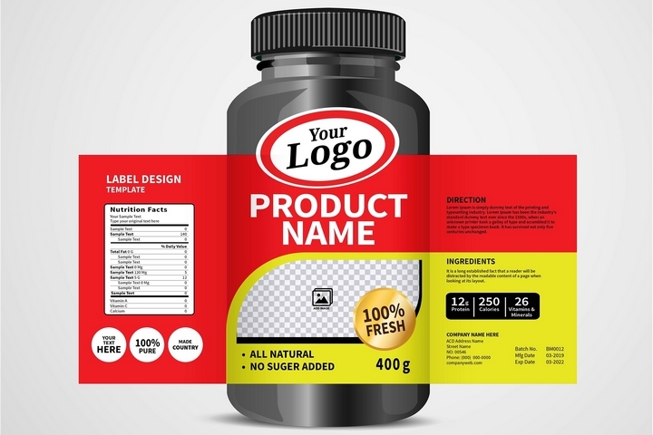
If colors and patterns do not, at first, draw us to a food product, certain fonts definitely will. This is because the sheer boldness and size of these fonts are so hard to miss, that we instinctively turn our heads to get a better look. It doesn’t have to come across in a quirky pattern either; the size itself will usually do the trick.
For example, certain beverage cans, such as beer, use bold fonts with one simple color. Modern brand identities that are successful rely heavily on this visual design, and are popular as a result. Keeping things simple in this light, can more or less yield higher sales!
Idea #6: Convenience

The old adage of having less translating to more can be attributed to food packaging ideas. For example, if you run a café or a diner, having your take-out menu items served in one package can do wonders for your business. Some fast-food locations already do this, by compartmentalizing several food items into one package that fits everything into one place.
This also contributes to overall packaging being wasted less. Not only does this make things easier to carry, but also contributes to a having a better impact on the overall environment as well. The more you become inclined to making things easier for your customers, the more you will see tangible results!
