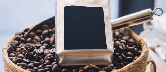
The marketing of any food product requires a lot of thought and planning. You may have manufactured the most delicious food product, but it won’t gain traction without proper advertising. Physical packaging is particularly crucial for promoting your food products,making them stand out on a retail shelf or a online website store.
Take, for instance, the packaging used to create coffee bags. An eye-catching design can be the difference between leaving a roast on its shelf, and purchasing it outright. Your coffee bag’s packaging design should be able to draw in consumers in a matter of seconds. When this happens, you are much more likely to make a sale!
Keep a consistent theme in your coffee bag packaging design, and you will eventually find one that works for your business. If you want to conceptualize your own design, consider these six coffee bag packaging design ideas:
Idea #1: Vibrant Packaging
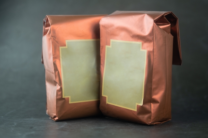
Colours can make or break a purchase for a potential customer. If used correctly, a product can draw in eyes due to the striking colour palette implemented. The same notion can be applied to the packaging for coffee bags. A good design will utilize colours in the best possible manner.
When designing your own packaging, pick a few vibrant hues and stick to those selections. Going overboard with bright colours can overpower your design goal, and may detract from a quality result. For example, pick two or three vibrant colours, and use them for the background on the bag.
Idea #2: Font Use
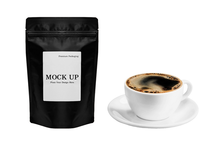
For the best coffee bag packaging design, choosing a beautiful font should be a priority. When it comes to using font on your coffee bag’s packaging, it’s best to keep it minimal. A minimal-esque approach provides customers with a better shot of noticing your product. As for the actual type of font to use, that will wholly depend on your design goal. For example, if you want quirky imagery, use a cursive-stylized font.
In addition, your chosen font should be legible. Going with a minimal approach doesn’t mean you have to make the name of your product extremely small. Have it displayed front-and-centre, and have it proportionally aligned with the bag’s dimensions. That way, it will help accentuate your chosen colours as well.
Idea #3: A Single Design Theme
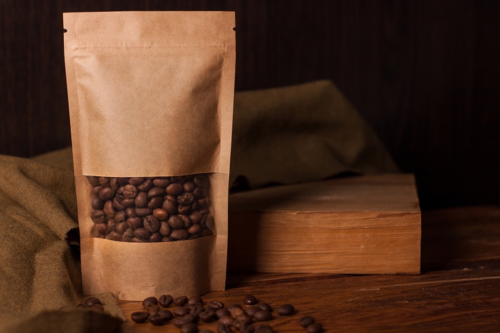
Many gourmet food companies will try to convey a luxurious feeling, when it comes to their packaging. To do this, they will use a singular theme that keeps secondary features to a minimum. With a strong font, and solid colour used throughout the design, that lavish sentiment can be reached.
Why not apply this same theme to your coffee bag packaging design? When these features are accurately implemented, your bag will appear as if it belongs in a fancy wine cabinet. This will also translate to more eyes and, in turn, more purchases down the line.
Idea #4: Pictures
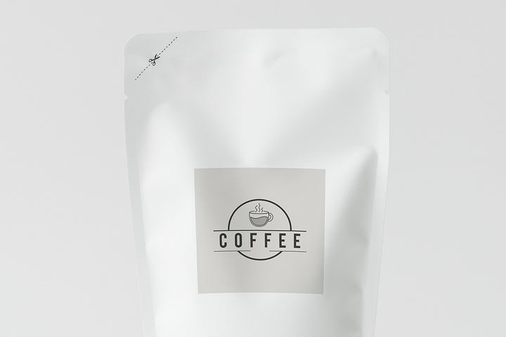
Using pictures in a modern day packaging design can be tricky to implement. That is because you don’t want it to ruin the overall theme that you have for your product. If you do decide to use a background image, for example, make sure it remains in line with your overall design.
For example, don’t just apply a photo on the bag’s design to fill up space. Use it intricately, so that the overall design flows better. The last thing any designer wants is to have their product ignored, due to an overpowering image. Use pictures efficiently, and your coffee bag will stand out better!
Idea #5: Geographical Design
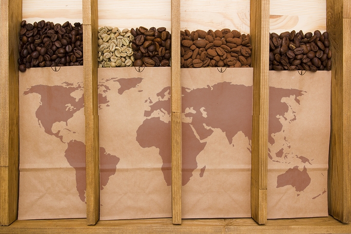
Many types of coffee roasts hail from different parts of our world. Therefore, when thinking about a potential design, use the roast’s geographical location as an influence. For example, a coffee roast from Kenya can use African-inspired art on the bag’s packaging. If used correctly, this can draw in customers for a better look.
Idea #6: Be Imaginative
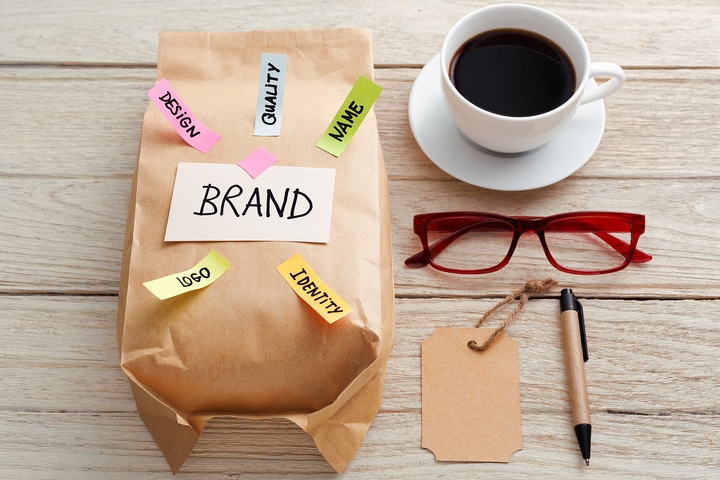
There are no limits to what you can come up with for your coffee bag’s packaging design. Use your inner creative designer to sketch out something trendy first. Experiment with various themes and imagery before deciding on a final packaging idea.
Your goal is to capture a customer’s attention by being creative and innovative with your packaging design. By making your coffee bags look different from similar competitors, the customers will usually inspect your product more closely. Even the tiniest details, such as a catchy slogan, a bigger font, or an unexpected packaging material may help to make your coffee bags stand out.
