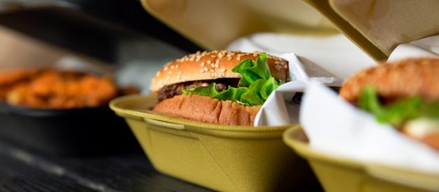
Fast food is a highly competitive industry with major players like McDonald’s, Wendy’s, KFC, Subway, and others vying for the consumer dollar. Regarding fast food packaging, we may undervalue the intelligence behind how and what materials are chosen. There’s a complex science behind fast food packaging design.
For starters, the fast food packaging ideas need to be practical and functional. Since the packaging deals with food, you must be extra careful and should conduct numerous packaging testing methods to prove the integrity of the packaging. In addition, you also need to take the design into consideration. An attractive fast food packaging idea will enhance the quality of your product.
Here are eleven fast food packaging ideas to help you create something memorable and branded:
Idea #1: Sugar straws
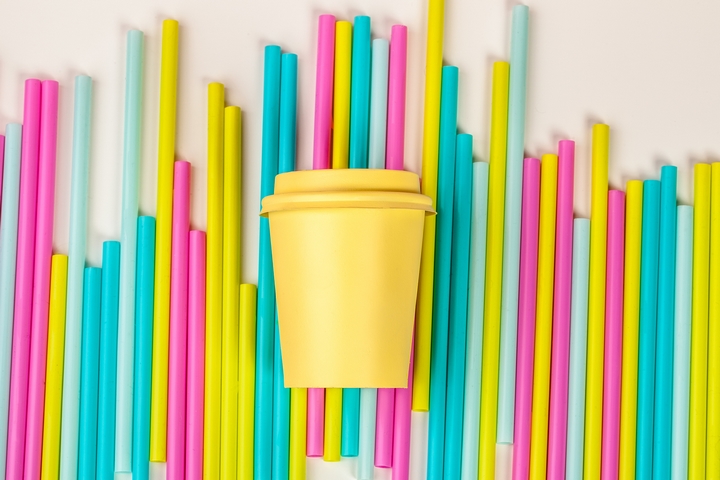
If your fast food restaurant is based around beverages, you can do something very interesting looking at what kind of straws you want to use. Starbucks in the past has used sugar straws as a means of giving customers a little extra on select drinks. Offering edible packaging like this is unachievable for a lot of companies but for some, they may find opportunity to do something special.
Idea #2: A mini projector

Another fast food packaging idea was provided by Pizza Hut. It’s a pizza box that doubled as a projector, as a means of marketing its new seasonal line of pizzas. It helped to stir up attention which is always a good thing. Although a projector’s been done, you may want to consider packaging that doubles as a similar item. It could be tech-related, smartphone-related or just plain fun.
Idea #3: Text i.e. quotes, catchphrases, stories, etc.
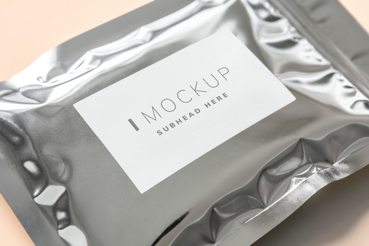
Plain fast food packaging with a few short lines of text or a small paragraph can make one powerful minimalism-influenced statement. The text you add should be fun, inspiring, or entertaining. On the sides of cups and bags, you can use simple stories to help communicate branding and where your values are at.
Idea #4: Social media packaging ads

Take your fast food packaging and create images or video around it to use across social media. Packaging is an immediate identifier for any fast food restaurant. Customers will hold it in their hands, take it home with them, and it’ll sit on their counter. When they see it, it reminds them of food. By using packaging in social media marketing, you’re tapping into a customer’s subconscious, encouraging them to re-order.
Idea #5: Building block packaging
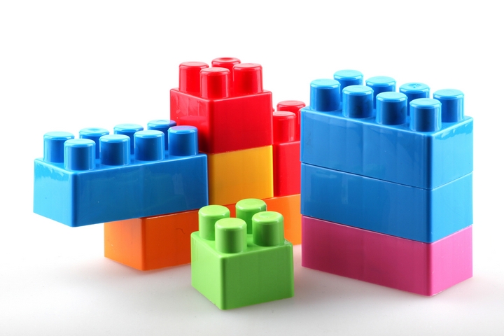
Do you know how LEGO bricks come together so smoothly and lock in together – the same’s possible with packaging. Creating advanced fast food packaging design that integrates every piece together can be a nice way to craft a meal. Some chains have experimented with this ‘building block’ concept in the past but haven’t kept it because these designs don’t always work. If you’re willing to be brave and attempt it, you may find yourself an instantly recognizable packaging design that’ll win you fans and social media shares.
Idea #6: Maximum color!
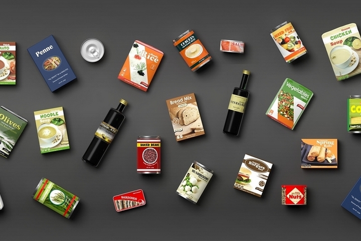
Colorful fast food wrapping isn’t popular because the color ink can cost more in addition to clouding up the simplicity of fast food branding. That said, some companies may prove it effective, using color to differentiate themselves from the competition. Color used strategically can really make an impact, especially if you aren’t a corporate franchise with pre-defined expectations on how to package food. Take the opportunity to be different!
Idea #7: Sync it up with an app

There are many ways to use packaging to include a QR code one can hover over and unlock promotions, discounts, or downloads. This is a smart move although can take some advance planning or app development. If you have a fast food app you want to encourage local customers to download and use, this might be a way to encourage them to use it.
Idea #8: Local artists

If you’re purely a local fast food restaurant, you may want to take the opportunity to connect yourself to local artists. For example, why not create a series of packaging designs where 4, 8, or 12 different artist designs are featured. You could even have a contest potentially, providing a prize to the customer who collects all bag designs. This is one way to go that’s unexpected, homegrown, and that can help embed you with locals.
Idea #9: Carry-friendly packaging
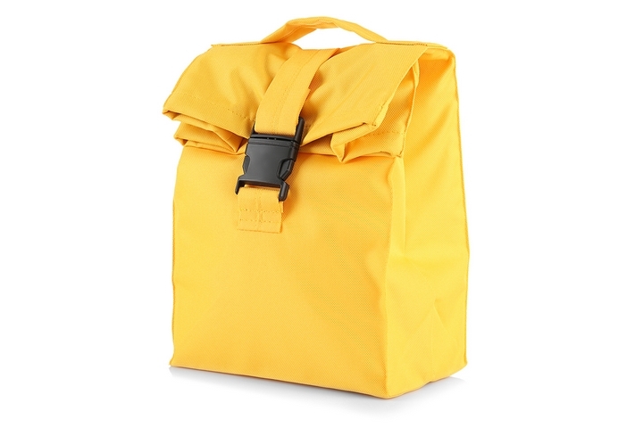
A lot of us are on the go, including commuters in the city cycling to work. Recently, McDonald’s released what they call McBike packaging. This is fast food packaging carrying a burger, fries, and a drink, with a hook that allows a customer to put it on their handle bars. It was only a 1-day promotion in a few cities worldwide but it just goes to show that you may want to consider the transportation of food and how a commuter may prefer to hold their meal.
Idea #10: Eco-friendly packaging
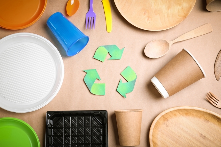
In this day and age, there’s no reason not to have fast food packaging made from environmentally sustainable materials. If you’re able to secure eco-friendly packaging for your restaurant, advertise it on the bag. A cup or bag that’s biodegradable communicates a brand cares about the environment and is another way to suggest your true values to a prospective customer.
Idea #11: Seasonal packaging

You don’t want things to start to feel repetitive or boring. As a fast food restaurant, you’re chasing mega brands with lots of marketing dollars. A way to help keep things different without looking like you’re changing the branding is to use color-coordinated seasons – 1 bag for spring, 1 for summer, 1 for fall, and 1 for winter. If you can afford the expense, this can be a nice way to advertise seasonal favourites and relevant promotions as well.
